

About the Images
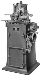
The main page uses an image of a Thompson Type Casting Machine. The machine shown is an early style of Thompson, as made by the Thompson Type Machine Company before its acquisition by Lanston Monotype. However, later styles of the machine, such as the one I use, differ only in detail. This image is taken from The Thompson: The Quality Type Caster. (Chicago: Thompson Type Machine Company, [n.d.]); see the Thompson Typecaster Source Material anthology on my hobby website, CircuitousRoot. This image is in the public domain.
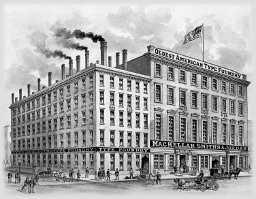
The Other Typefoundries page uses an image of the MacKellar, Smiths and Jordan typefoundry. This image is taken from their 1896 publication One Hundred Years. It is in the public domain.

The Our Type pages use an image of a Lanston Monotype Machine Company Type-&-Rule Caster display matrix. Such a matrix will also cast on the Thompson. This is from a Lanston booklet "Monotype Matrix Information" published, probably, in the 1935-1940s timeframe and included in contemporary editions of the Monotype Type Faces specimen book. see Matrix Data, Specimens, & Typography: Lanston Monotype Machine Company on my hobby website, CircuitousRoot. This image is in the public domain.

The About LemurType page uses an image of a typefounder's Lining Gauge. This particular gauge is a Measuring Lining Gauge with a micrometer built in for calibration. It is similar to the Lanston Monotype gauge that I use, save (a) that it has a "window" through which to view the type alignment (mine has simply a straightedge) and (b) it lacks a holder for a loupe. From Type Founders' Equipment. (London: The Williams Engineering Company, ca. 1919.) I have scanned this volume and placed it online on The Internet Archive.

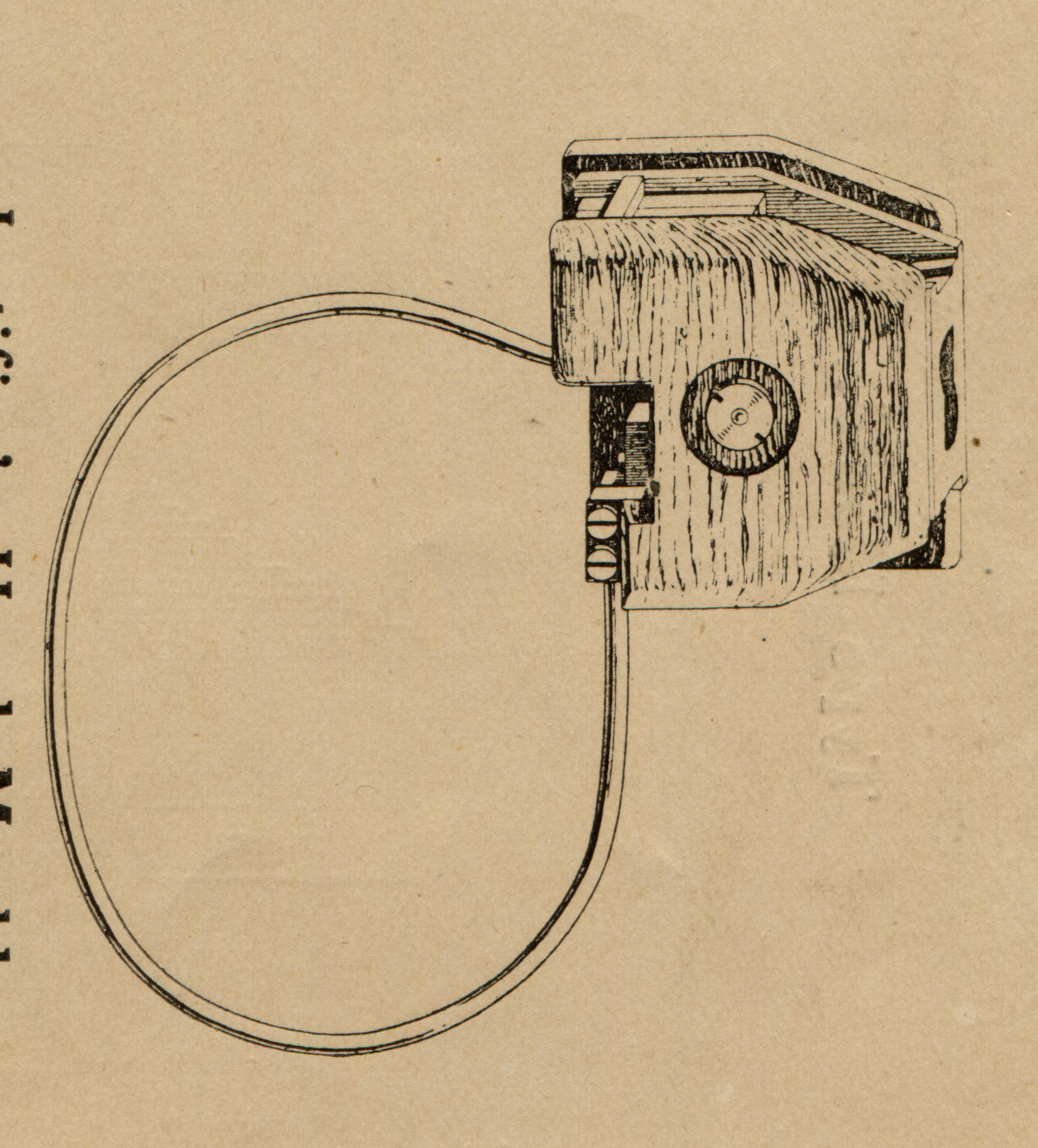
The various pages about Understanding Metal Type use an image of a typefounders' hand mold. As the mold illustrated was produced in the early 20th century when such molds were used only for casting proof-types during the process of justifying matrices, its manufacturer called it a "Justifier's Hand Mold. From Type Founders' Equipment. (London: The Williams Engineering Company, ca. 1919.) I have scanned this volume and placed it online on The Internet Archive. There aren't enough images of hand molds floating around the web, so here is a full-size version of this one: williams-nodis-type-founders-equipment-1200rgb-halfpage-05a-crop-handmold-2704x2992.png. It is in the public domain.

The Parts of a Type page uses an image of a composing stick held in the hand. This is from Practical Printing. (Sixth Edition), by John Southward, Arthur Powell (4th & 5th eds.) and George Joyner (6th ed.) (London: The "Printers' Register" Office, 1911.) It is in the public domain.

The Parts of a Type and The Dimensions of a Type pages use an illustration of a type, with parts identified, which appeared in various ATF publications. This particular image was scanned from Type Faces: Descriptive Index and Price List of ATF Foundry Products. TY-111. (No date; this book has a 1940s look to me.) The original is in the public domain, and I dedicate my digitally processed version to the public domain. (Yes, you can take it and use it in your term paper, without even asking permission. Good scholarship, however, requires that you fully identify its origins and your sources.)

The Dimensions of a Type page uses a specimen of ATF Heavy Copperplate Gothic, 12 point, in four sizes. This is from the 1923 ATF Specimen Book and Catalogue. I should note that Copperplate Gothic (or its Ludlow equivalent, Lining Plate Gothic) is on a screen a remarkably ugly face. In metal type it is actually very delicate and, I find, endearing.

The Type As It Is Set page uses this image of a type with two horizontal kerns. It is from Lucien Alphonse Legros and John Cameron Grant's monumental 1916 work

The Type As It Is Set page uses this representation of solid set vs. letterspaced type. I drew this myself, but for the spacing followed an example in I.T.U. Lessons in Printing: Unit 1, Elements of Composition. (Indianapolis, IA: International Typographical Union, 1957): p. 264.

The Type As It Is Set page uses this image of mortised type. It is from the 1953 edition of the catalog of the Western Newspaper Union (where it was used in advertising the Rouse Type Mortiser). It is in the public domain.
The Type As It Is Set page uses this image of type with leading. There is some irony here because it comes from a publication by the Ludlow Typograph Company promoting their slugline (i.e. linecasting) system over traditional metal type. It does, though, show the leads nicely. From
All of the pages use this typographical ornament. It is No. 1 in the "Modern Dash" set which appears on p. 707 of the 1923 Specimen Book and Catalogue of American Type Founders Company. I scanned it from the original, and really ought to go back to clean it up a bit more. It is in the public domain.
![]()
The LemurType logo is meant to suggest an end-on view of a traditional hand mold, with the matrix removed and a cast type, 'R', in place in the mold. The 'R' is, correctly, wrong-reading. Ironically, the 'R' is in Bitstream Vera Sans, a typeface for which I do not believe matrices have ever been cut. This logo is copyright © 2011 by Dr. David M. MacMillan and is a trademark, not yet registered, of LemurType LLC. Please do not abuse it.
© 2011